(11 min read) If you don’t know a narthex from a nave, a chancel from a chapel, or an architrave from an archivolt, then this is the post for you. But even those well-versed in the terminology of church architecture will appreciate the many photographic examples I use to provide a “virtual tour” through a hypothetical Gothic cathedral.
Gothic architecture was originally developed for churches during the 12th century (see my short history of Gothic here), and — though secular Gothic buildings exist — Gothic architecture finds its ultimate expression in the cathedral. (Note: I am using the term cathedral loosely here to refer to any “great church,” whether technically a cathedral, abbey, minster, basilica, or church.)
While there are many exquisite smaller churches and chapels, cathedrals typically contain all the features that you would find in any church or chapel, making them ideal for understanding architectural terminology. If you understand the parts of a Gothic cathedral, you’ll understand the parts of all Gothic churches. (In fact, you’ll understand the parts of pretty much all traditional Western church design, regardless of the style.)
An Archetypal Cathedral
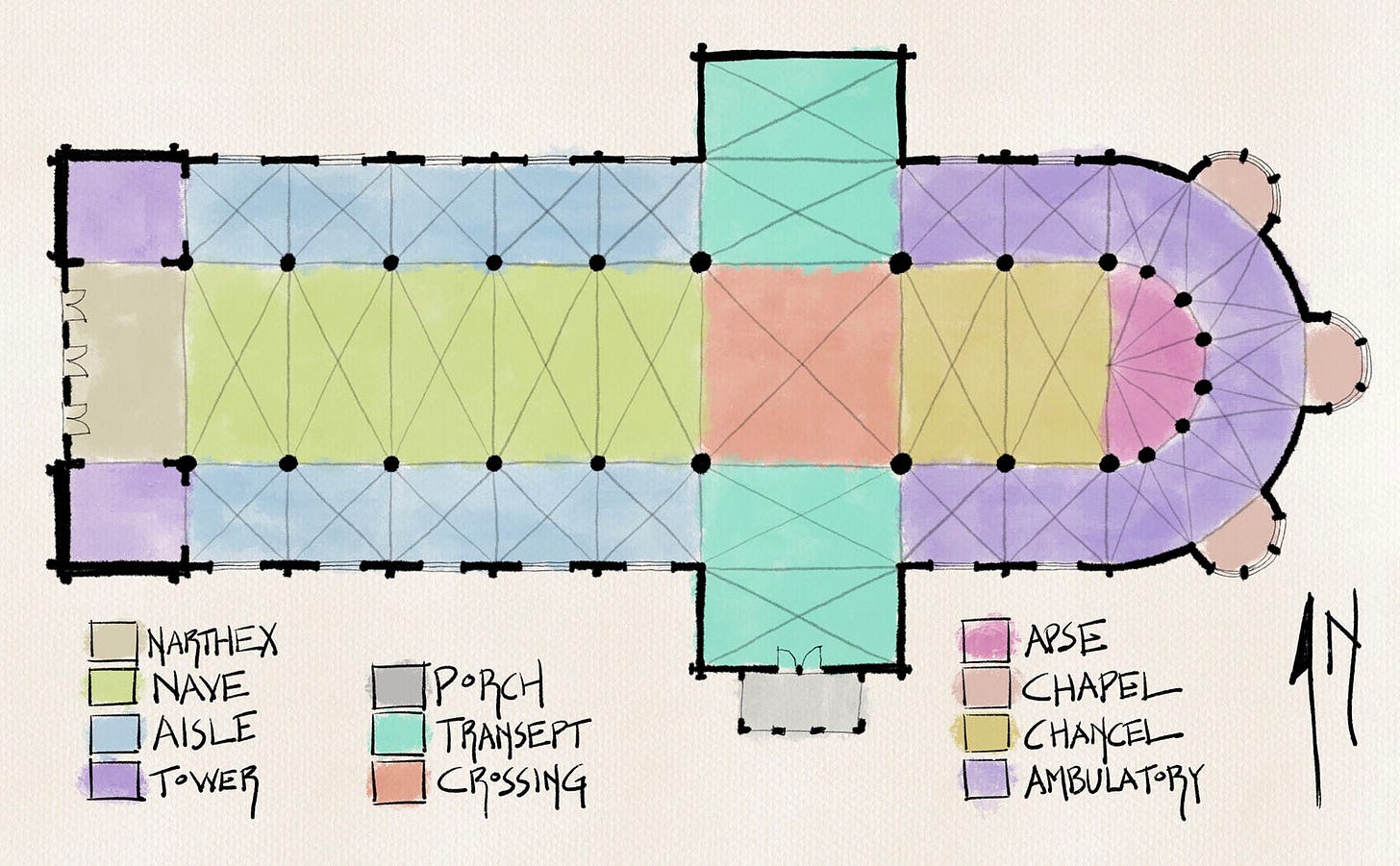
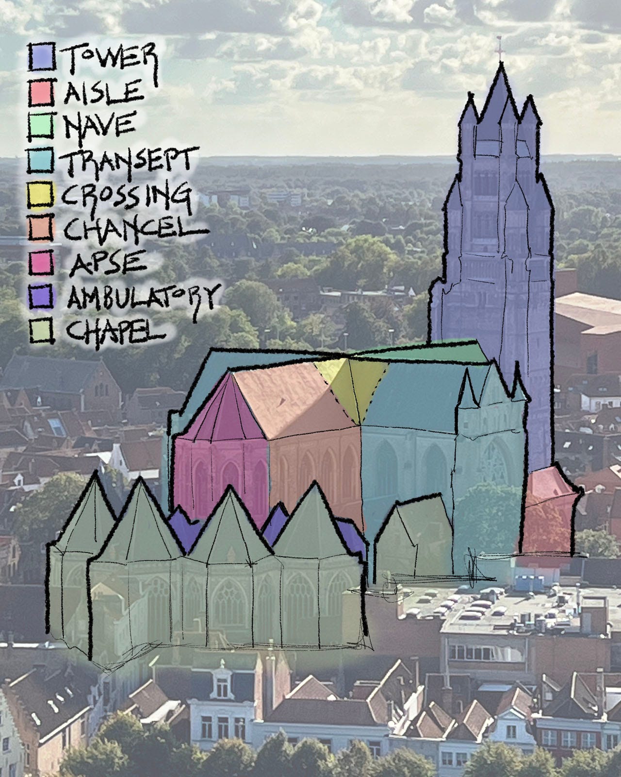
To that end, I have drawn a plan for an imaginary archetypal cathedral (figure 1), and color coded it with all the major building elements you’ll find in it. I’ve also drawn over and color-coded a photograph of St Nicholas’ in Ghent with a similar key and color-coding (figure 2); it doesn’t show every single element that is in the plan, but it does show most of them.
Before we get into specific parts, let’s look at the plan as a whole. Note that it shaped like a cross, which is intentional — the cross is Christianity’s most important symbol, after all. Furthermore, this is what is called a “Latin cross,” which means that one side is longer than the others. This is the church tradition of Western/Roman/Catholic Christianity; in the Eastern/Byzantine/Orthodox tradition, church building plans are in the form of a “Greek cross,” in which all four sides are the same.
Also, note that I have shown a north arrow pointing up. With very rare exception, all Gothic churches are always oriented so that the holiest parts of the church — the inner sanctum of the chancel and apse — are on the east side, and the more public areas — the nave and side aisles — are on the west. The very rare exceptions to this rule that exist (and a few do) only prove it.
Speaking of exceptions, I should make it clear that every cathedral is different: many do not have some of the elements I’ve included in our hypothetical example, and a few multiply the parts I’ve included — with double side aisles or many more side chapels, for example. My plan is purely hypothetical, and permutations and variations abound, as we will see in some of the photos I’ve chosen to illustrate things.
With that introduction out of the way, I think it is time to start out tour of this imaginary cathedral with some real examples. Let’s enter through the west doors, traditionally the main ceremonial entrance.
The Narthex & Side Rooms
The narthex is not a particularly common element; of the cathedrals I’ve documented, probably less than a third have them. In such cases, once you cross through the west doorways, you are immediately in the nave.
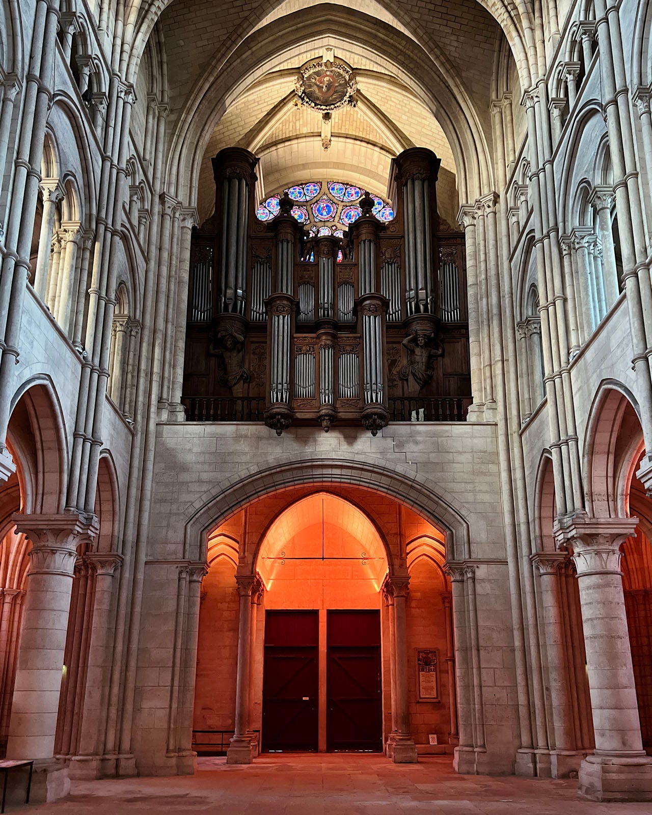
However, in the interest of completeness, I thought it best to include one in our hypothetical building. When there is a narthex, it typically acts as a vestibule with a lower ceiling than the nave, and a gallery above. These days the galleries are often fully occupied by an organ, as you can see in figure 3, which shows stately Laon Cathedral’s narthex and gallery from the nave.
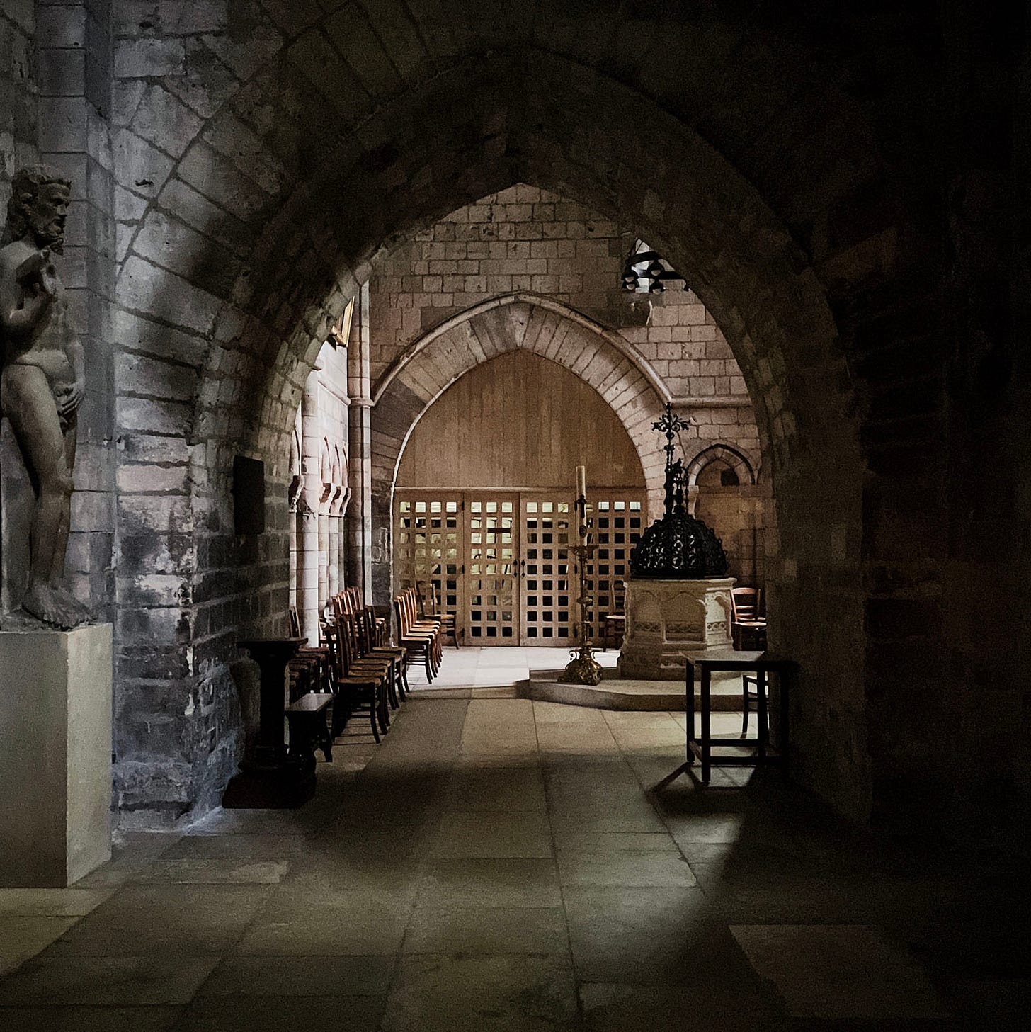
Rouen Cathedral also has a narthex (not shown) and uses the north side room as a baptistry, as you can see in figure 4.
The Nave
The nave is typically the largest space in the cathedral, as well as the highest (though sometimes the crossing will be taller, and occasionally even the chancel).
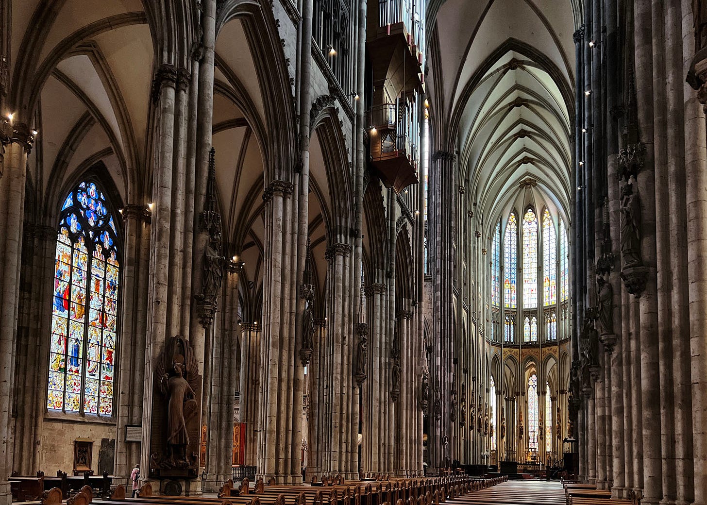
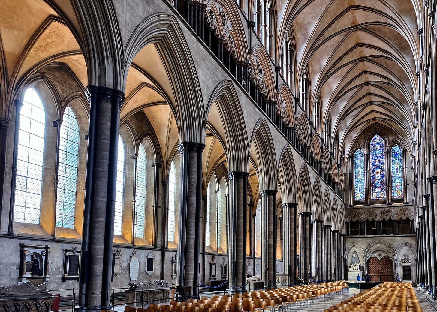
The opening image of this post showed the nave of Cologne Cathedral, and figure 5 above shows Salisbury. A quick comparison of these two 13th century cathedrals show some stylistic differences. For example, the English at this stage were into stressing horizontal layering, whereas the the French were obsessed with height (Cologne’s cathedral, though located in Germany, was highly influenced by contemporaneous French design).
Despite the differences though, both are built from the same basic pieces — if you look at the wall elevation of each, you will see that they have three levels. There is the arcade at ground level, the triforium above that, and then the clerestory level. This is typical, though sometimes a great church will leave out the triforium.
The distance from one column to the next is called a bay, and churches and cathedrals may be composed of any number of bays. The bay size set by the nave determines a lot of other cathedral parts as well. The side aisles — visible behind the arcade in both of the examples I show — are necessarily determined by the nave, of course; and andthe sizes of transepts and chancel bays are often the same as well.
Side Aisles
Side aisles typically exist on both sides of the nave in a cathedral, with ceilings that are perhaps half as high. Smaller parish churches often don’t have side aisles at all, or may have them on one side only. There are also a handful of cathedrals with two sets of side aisles — if you look really closely at the introductory photo of Cologne Cathedral, for example, you will be able to make out that it is in this select club.
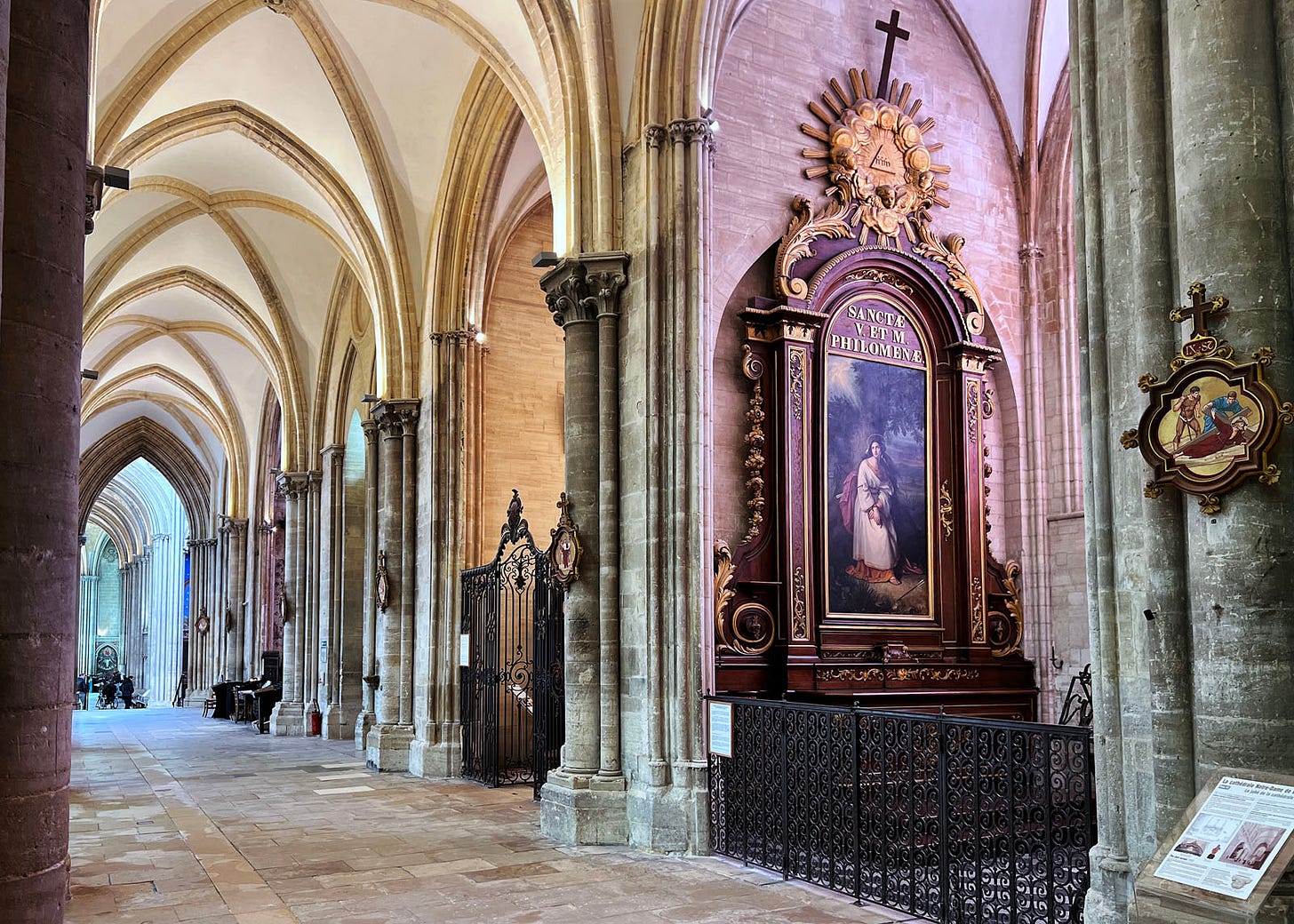
Figure 6 shows Bayeux Cathedral’s south side aisle. As you can see, instead of a wall on the side opposite the nave — as my plan shows and as you can see in the images off Cologne’s and Salisbury’s naves — it is lined with small chapels, one for each bay. This is fairly common in a good-sized cathedral.
Transepts
If you were to walk down the length of the south side aisle and then turn and look to your left when you entered the south transept, you’d see a view much like figure 7.
This shot nicely takes in both the north transept (on the left side of the image) and the crossing (in the foreground and more to the right) of Lincoln Cathedral.
Transepts are a lot like the nave, often with same dimensions. They rarely have side aisles, but chapels on one side are not uncommon.
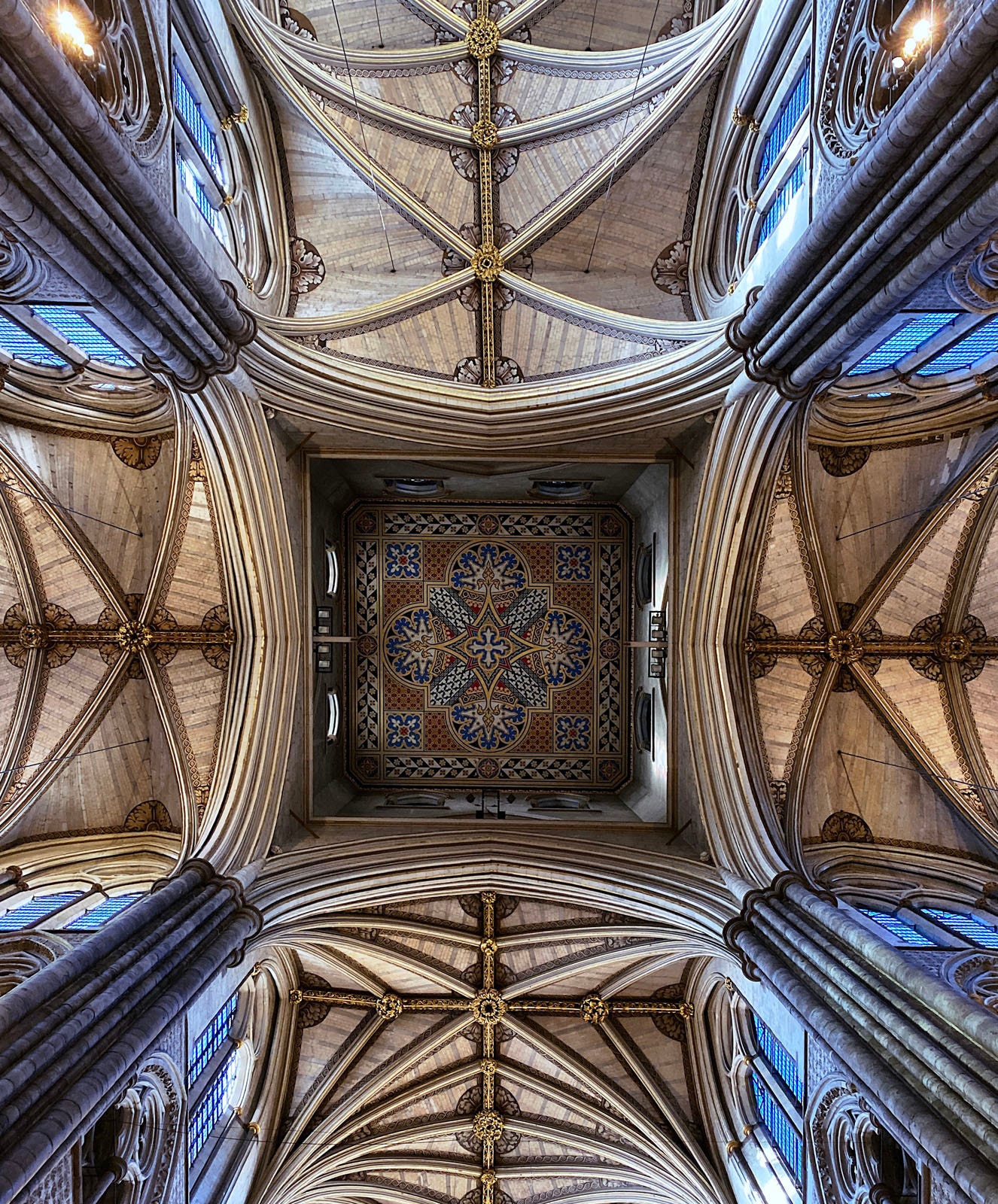
Notice how the ceiling seems to be higher in the front of the image of Lincoln. If you were to walk to the middle of the crossing and look straight up, you’d see something a lot like figure 8.
Crossing
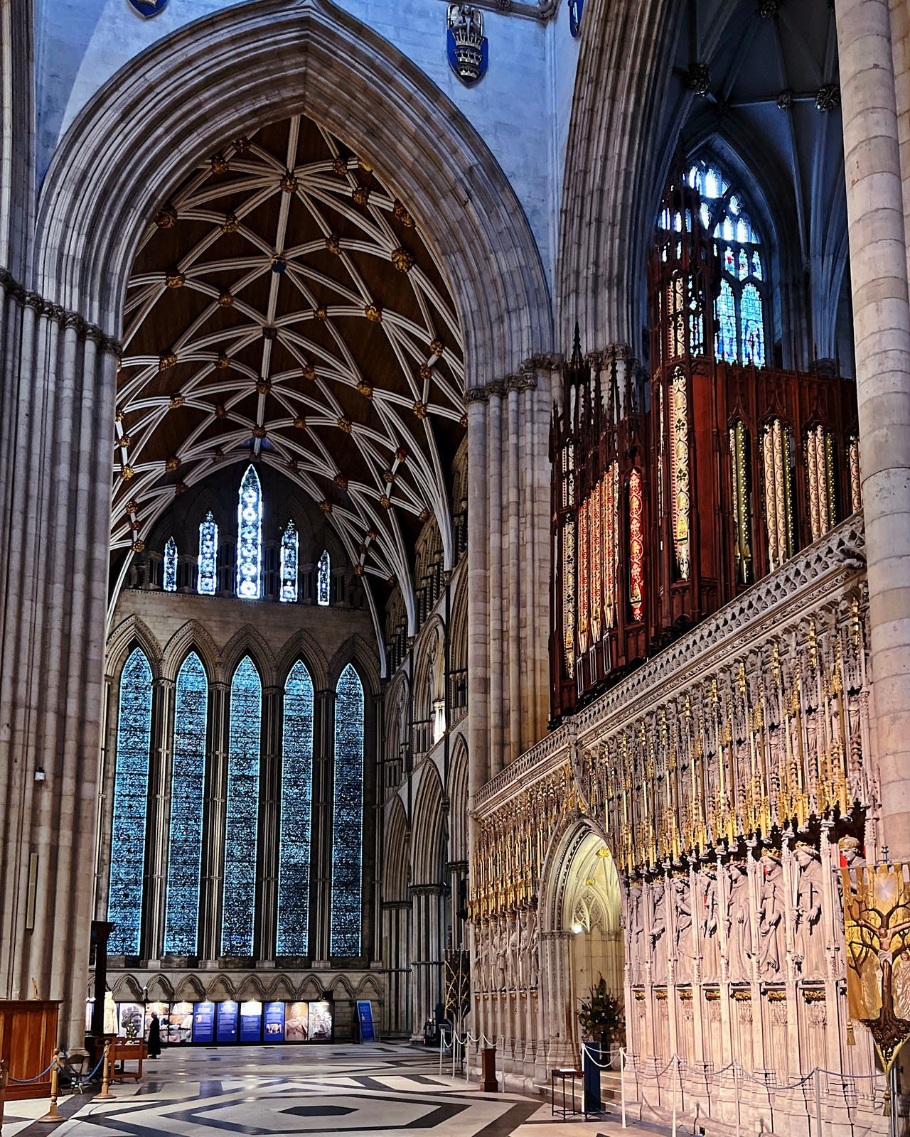
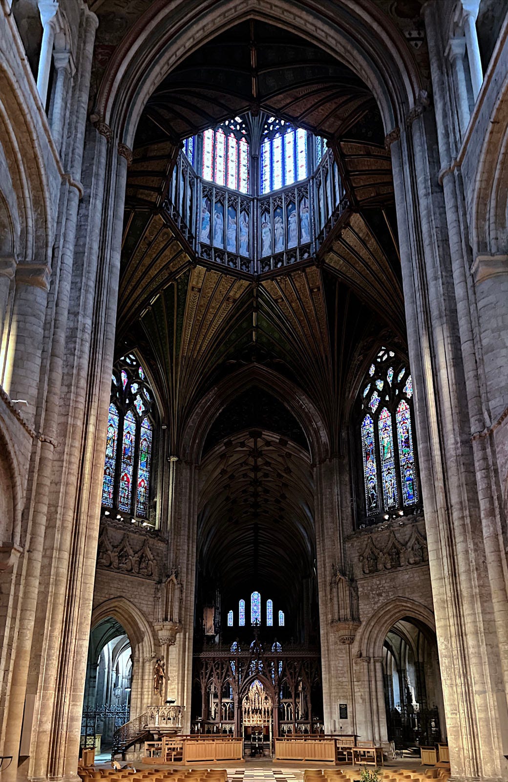
The crossing is where the transept, nave, and chancel all meet. Sometimes the vaulting here is simply a continuation of the vaulting of one or more of the “arms” coming off it and the ceiling spaces flow into each other. But it is often the case that a tower will be located here with a higher ceiling and perhaps windows to bring light into the space, as you can see in figure 9 of Westminster Abbey and figure 9 of Ely Cathedral.
Crossings often have altars located in them nowadays, but in medieval times, the main altar was always placed in the chancel and/or apse. The chancel side was also often screened off from public view (and access). Some, but not all, cathedrals still have these “rood screens” — you can see a substantial stone one at the far right in figure 7 if you look closely, and at the bottom of figure 9 there is a lacier wooden screen.
Chancel / Choir / Presbytery
In my plan, I mark the chancel and apse as separate building elements, though they are typically a single open space, and in my writing I often call the whole thing the chancel. I might also call the whole space the choir, as many others do (or even quire). Less commonly, and a little old-fashioned, is the term presbytery.
Regardless of the name, this is the inner sanctuary — often closed to the public even nowadays, and certainly closed to the public in the Middle Ages.
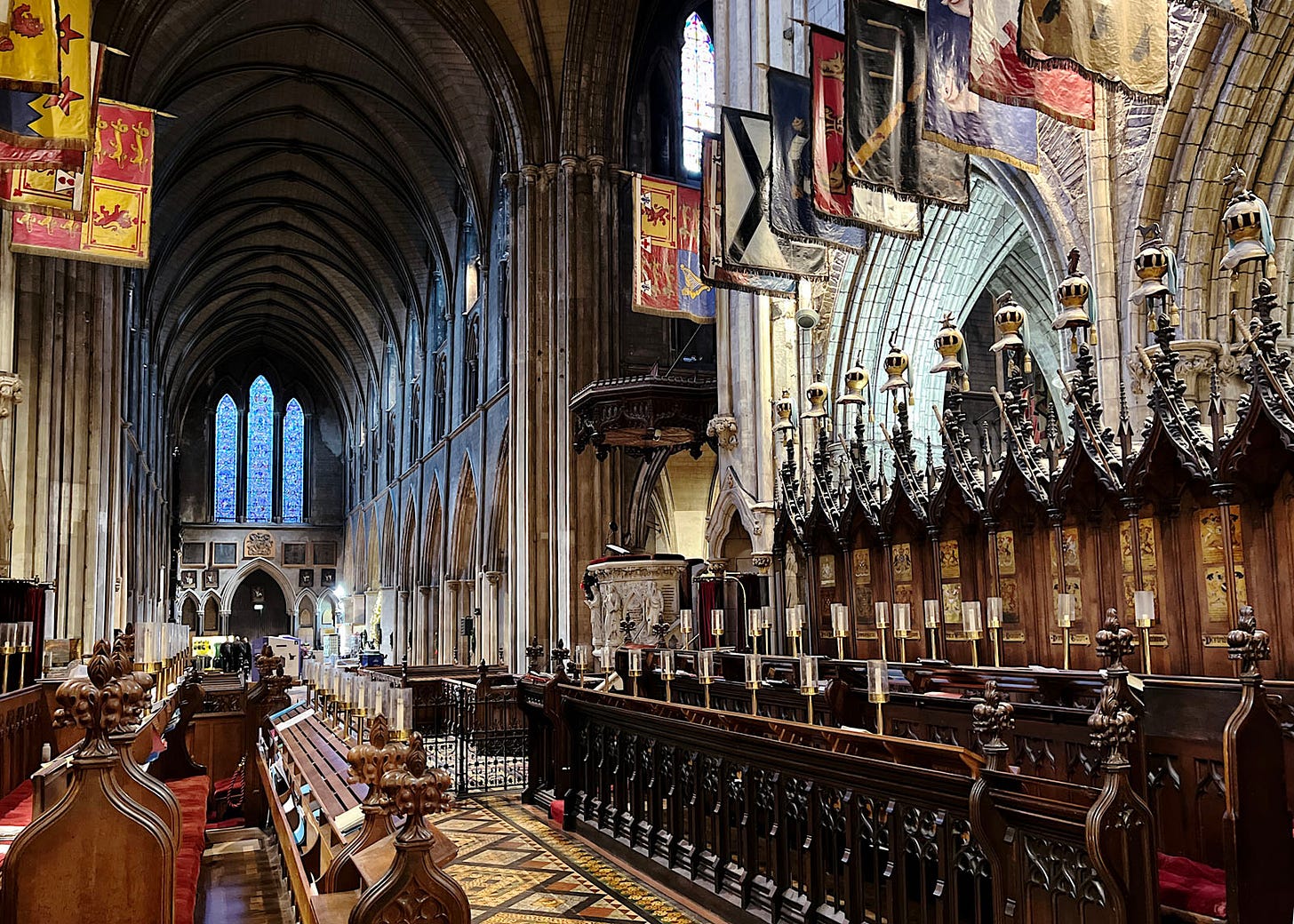
Despite being one big open space, the chancel/apse combos are usually divided into two functions: a choir on the west side, and a high altar on the east. Figure 10 shows the choir at St Patricks’s in Dublin, looking towards the nave (and note that there is no rood screen in this church).
Apse / High Altar
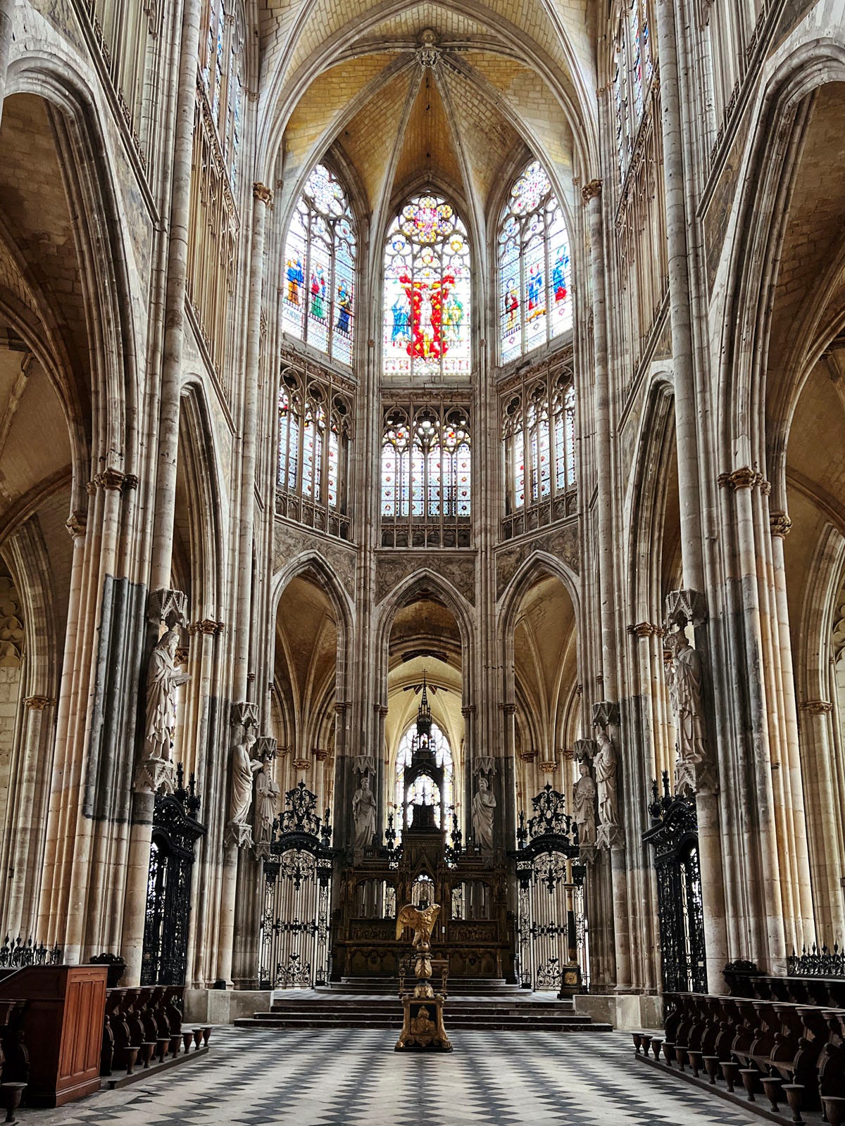
If you were standing in the middle of a choir space and turned around, you would see an image a lot like figure 11.
Technically an apse means the semicircular termination of the space, and many churches terminate the east end of the church with a straight wall (typically with a grand stained glass window behind the high altar). So I am as likely in my writing to call this area the high altar, regardless of whether it is semicircular or not.
Ambulatory
Surrounding the chancel and high altar in our hypothetical cathedral is the ambulatory. This is essentially a u-shaped side aisle (figure 12), in which one can walk (“ambulate”) around the entire inner sanctum of the cathedral. These almost always have a few chapels off to one side, as shown in my plan.
Side Chapels
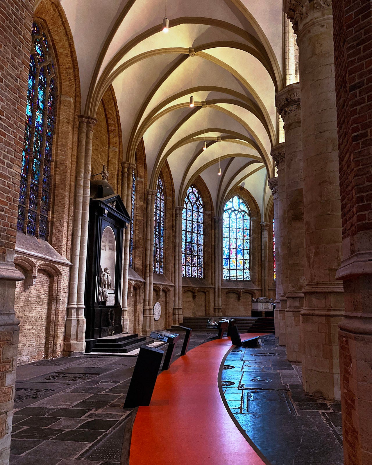
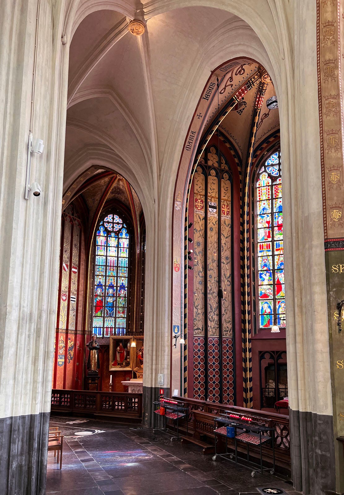
I only showed three chapels off to the side of the ambulatory in my plan above, but ambulatories are often entirely lined with side chapels, as the example in figure 13 shows.
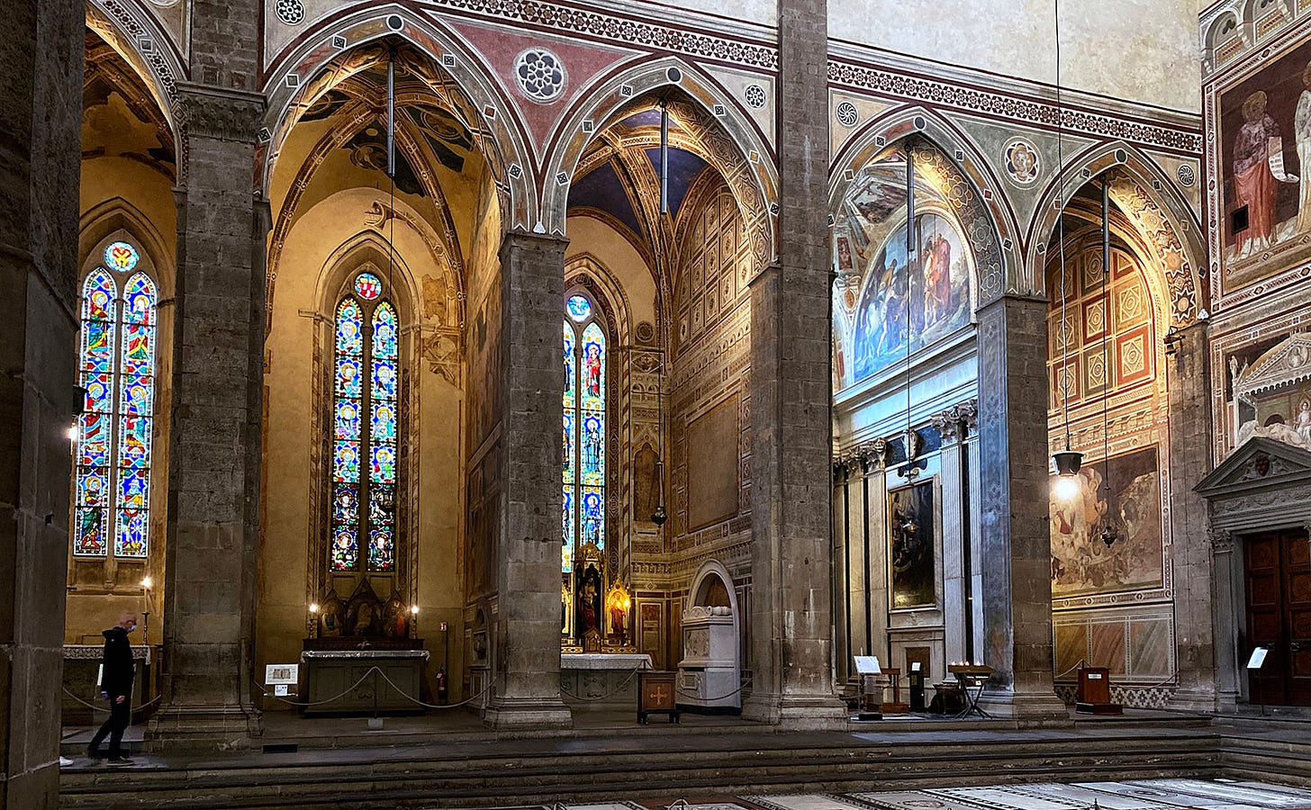
And of course, as we saw in figure 6 above, chapels are often located off side aisles. Figure 14 even shows a set of side chapels off the south transept of a Florentine basilica; here there is no side aisle.
Porch
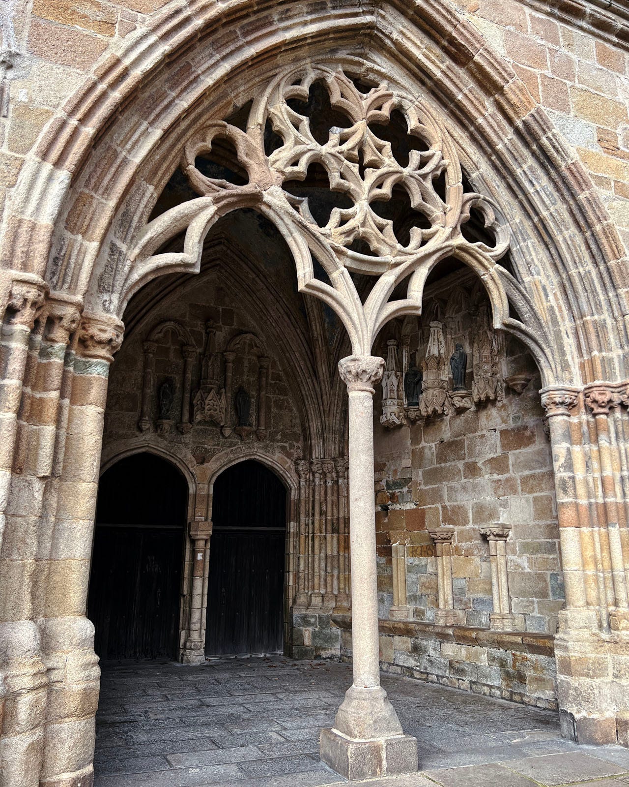
The only element of my plan that we have not yet discussed is the porch, sometimes called a portico. Like the narthex, these are not particularly common in cathedrals, though they are fairly common in parish churches.
When they do occur in cathedrals they are typically attached to a side entrance, as in figure 15, or on either the north or south transept. I cannot recall ever seeing a porch on a cathedral’s west side. Speaking of the west side…
West Facade
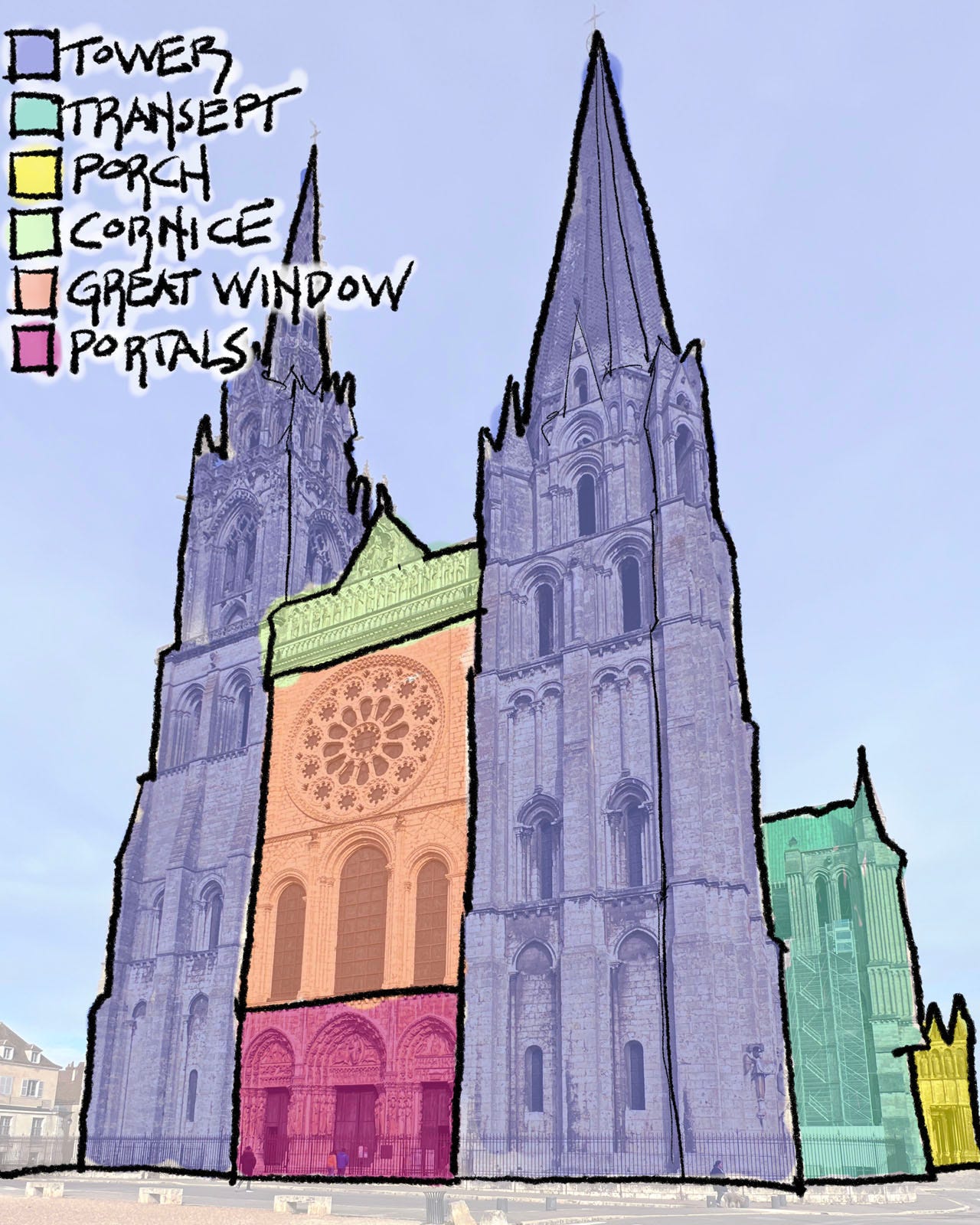
Figure 16 shows the west facade of Chartres Cathedral, an archetypal Gothic facade if there ever was one. Most of the other sides of cathedrals (as you saw in figure 2) are an agglomeration of side chapels, side aisles and flying buttresses, perhaps giving the sense — not entirely wrong — that what you are looking at is the backstage framework for the show inside. The west facade, on the other hand, was the ceremonial entrance to the cathedral, and often fronted a public square. So west facades were given a lot of attention.
The color coding in figure 16 shows the four main typical elements to a west facade. In between two towers, we see three layers of building components: a cornice above, a set of great windows in the middle, and a set of three entry portals at ground level.
This is a classic layout, especially in France, though west facades display a lot more variations — both regional and idiosyncratic — than the plans. Sometimes there are no towers, sometimes one huge tower forms the entire facade. There are usually great windows, but not always.
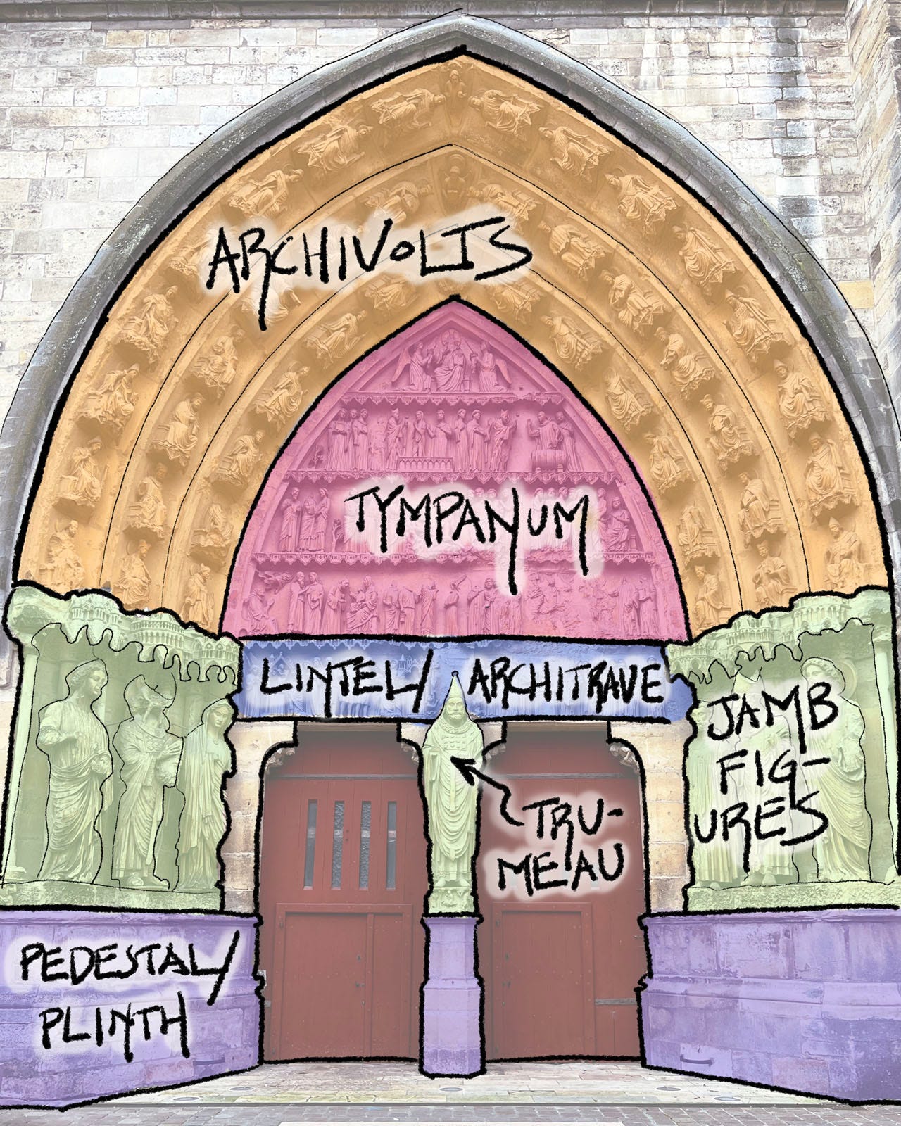
The only certainty is there will be an entry portal. And it will almost always follow the layout you see in figure 17.
A good portal — or even better, a good set of portals — is one of my favorite parts of a cathedral. And so, in our next three posts in the Gothic section, we are going to take a really close look at the nine portals of Chartres, starting with the three you see at the bottom of figure 16. As a set, these are probably the greatest portals of all time, and well worth a close look.


Great information, fabulous pictures, and very nicely written
For the first time it now starts to make sense. Great info and equally great pictures.